














A homeowner staring at a broken limb after a storm searches for help within minutes and picks a company off the first few results almost as fast. Tree service website design decides who gets that click.
The photos, the layout, and how quickly the page loads all tell a visitor whether a crew shows up looking professional, or shows up looking like a gamble.
Most tree company sites make the same mistake. They open with stock photography of a generic forest instead of an actual crew running a chainsaw.
And the phone number sits three scrolls down, after a paragraph about company values nobody came here to read.
What tree service website design gets right before anyone reads a word
Researchers at Stanford's Web Credibility Project spent three years studying how people judge a site. Visual design turned out to be one of the first things a visitor evaluates, ahead of almost anything written on the page.
The same guidelines name a second factor nearly as strong: contact information that's actually easy to find. A phone number, not a contact form buried three menus deep.
For a tree company, that translates into specifics:
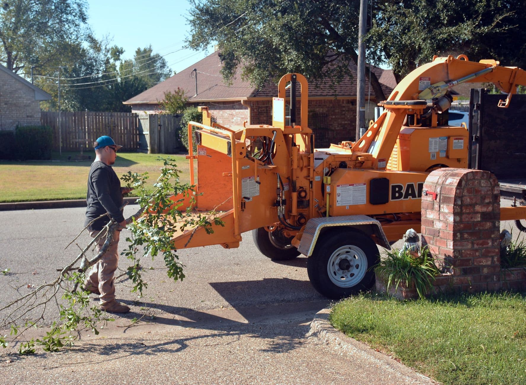
Real photos: a crew in gear, a bucket truck mid-job, the stump grinder that just cleared a driveway.
The ISA certification and insurance stated plainly, alongside the towns actually served instead of a vague coverage claim.
A phone number on every page, not tucked into the footer of one.
Make the quote request the easiest thing on the page
Storm damage and a dead limb over the roof feel like emergencies to the person calling, whatever the calendar says about your schedule.
A visitor who has to hunt for a way to ask about a quote just calls the next name on the list instead.
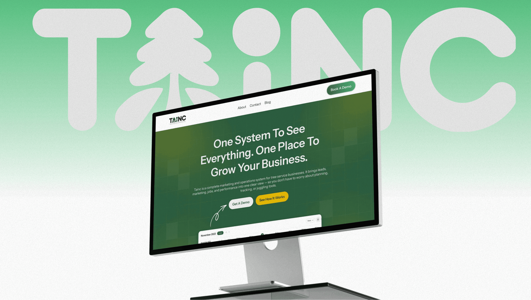
That's the problem this tree service growth platform was built to solve: routing every emergency call and quote request into one simple flow instead of scattering them across separate service pages.
A short quote form belongs near the top of the homepage, not only on a dedicated contact page. The phone number should repeat at the top and bottom of every service page.
Most of these searches happen from a phone in a driveway, not a desktop at a kitchen table.
Google's own guidance calls a responsive layout the easiest way to keep that experience solid: one page that adapts to the screen, not a separate mobile version that drifts out of sync.
Speed and structure decide whether Google shows the page at all

Photo by MART PRODUCTION on Pexels
Google's own performance team publishes case studies on what a faster page is worth. When Vodafone Italy cut its Largest Contentful Paint by 31%, the company reported 8% more sales without touching anything else on the page.
A tree service site loaded with unoptimized job photos will feel that same effect in reverse. Slow pages lose the searcher before they ever see the estimate.
Structure matters as much as speed. Separate pages for tree removal, stump grinding, and storm cleanup give Google something specific to match against a specific search, instead of one page covering all three badly.
The same logic applies to location: name the towns and counties you serve instead of a single line about a service area. Our guide to tree service local SEO covers how to structure those pages so they actually rank.
Keep the site consistent with your Google Business Profile too. Matching hours, matching service areas, and matching photos across both keeps a visitor from wondering whether they landed on the wrong business partway through a search.
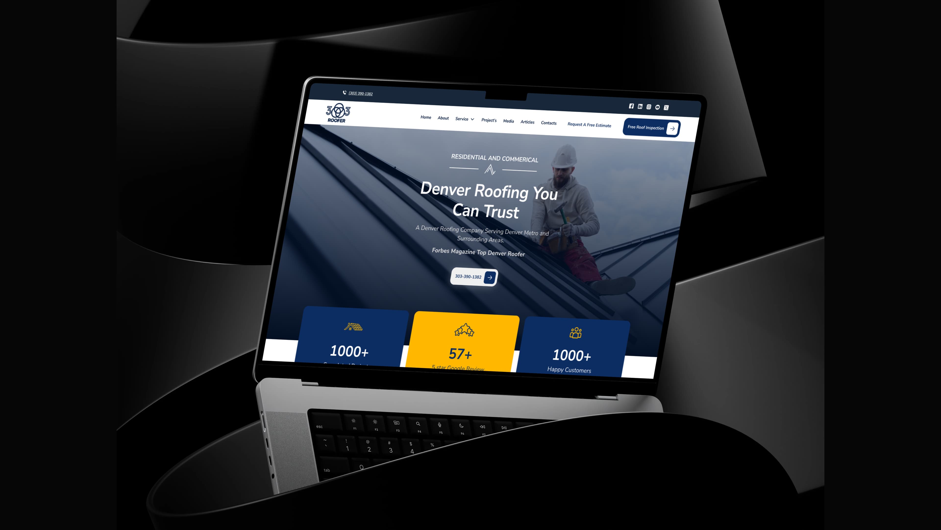
If the site hasn't been redesigned around what actually gets a visitor to call, that's the gap our UI/UX work closes. Fix the photos, the contact info, and the load time first. Those three decide whether the rest of the page gets read.
Cover photo by John Robertson on Pexels
Sources
Stanford Guidelines for Web Credibility — Stanford Web Credibility Project
The business impact of Core Web Vitals — web.dev (Google)