










Search for a doctor and most of the decision happens before anyone reads a word. A cluttered logo, a stock photo of a smiling model in a white coat, a font that doesn't match between the website and the intake form: all of it registers first.
That collection of signals is what healthcare brand identity actually is. It does more persuading than the services page sitting underneath it.
What healthcare brand identity is actually worth
Deloitte tracked more than 37,000 consumer responses between May 2024 and January 2026, using what it calls its TrustID methodology. Health care organizations scoring higher on trust saw two and a half times the consumer loyalty of their lower-trust peers.
That gap matters more here than in most categories. A patient can't test-drive a hospital. They lean on whatever they can actually see instead: whether the tone in a confirmation text matches the sign outside, whether anything feels like it was assembled in a hurry.
Deloitte's separate modeling, built from over 42,500 responses across 100-plus life sciences and health care organizations, puts trust behind roughly half of what makes a patient value one provider over another on average. A patient rarely names any of this consciously. They just leave.
What two health systems actually changed
Michigan's Corewell Health shows what consistency costs to build properly. When Beaumont Health and Spectrum Health merged in 2022, the combined system spent months settling on a name before announcing Corewell Health on October 11 that year.
The identity centers on interlocking Cs and a palette of blues and greens carried over from the three merging brands. Twenty-two hospitals and three medical groups adopted it in phases over roughly two years, down to the signage on the buildings.
Naples Comprehensive Health took the same logic at a smaller scale, introducing its new name and a bolder color palette on September 7, 2023. CEO Paul Hiltz tied the move directly to trust, saying the new identity needed to communicate the system's level of care rather than just assert it.
Neither system treated its rebrand as a logo swap. Both phased it deliberately, across every physical and digital touchpoint, rather than changing the sign out front and leaving the forms and emails as they were.
Where this shows up without a merger to announce

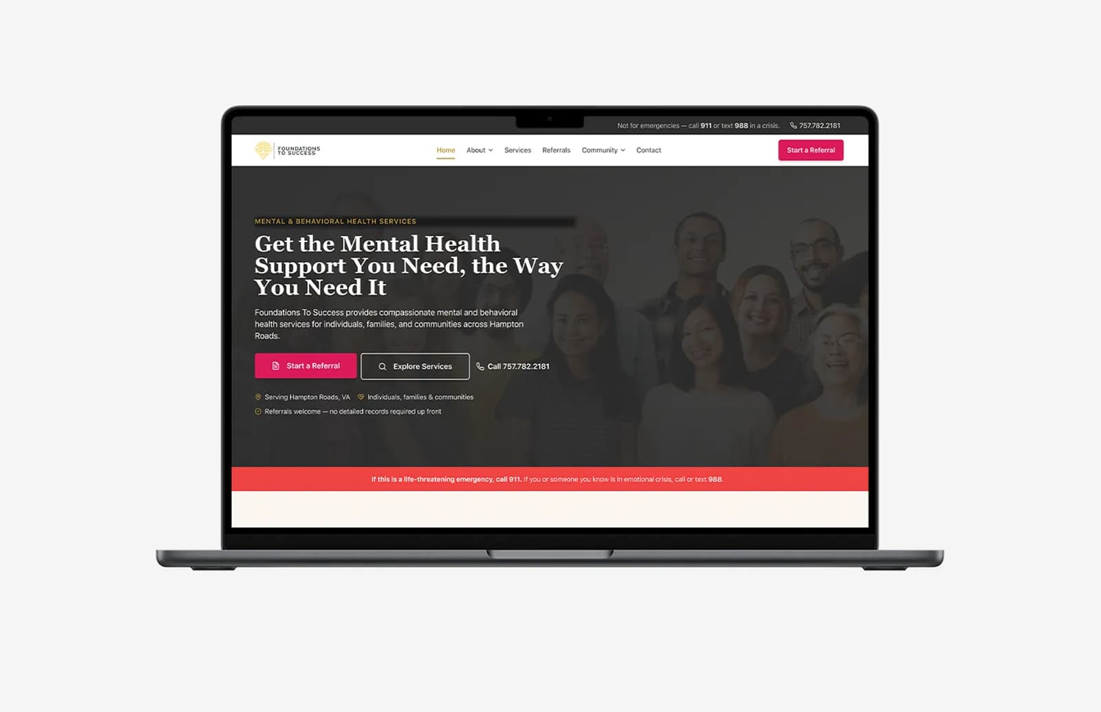
Few practices need a merger to justify a rebrand, but the problem scales down fine. A patient who fills out an intake form in one font, reads a confirmation email in another, and lands on a website resembling neither is absorbing a small signal that nobody is quite in charge.
Fixing that is a consistency job more than a design one: one voice and one visual system across the website, the booking flow and every message a patient gets afterward.
That's the work behind our own brand identity and creative engagements, agreeing the logo, color system and tone once, then making sure it survives every touchpoint a patient actually uses.
The website carries more of that weight than most practices assume. Our UI/UX work on projects like the OptimalMD platform starts from the same premise: patients decide how much to trust an organization before a clinician ever walks into the room.
Consistency doesn't stop at launch. A patient who gets a follow-up email written in a different voice than the website is relearning who they're dealing with, and each relearning taxes the trust a rebrand just spent months building.
Ongoing marketing and growth work keeps that voice steady once nobody's talking about the new logo anymore.
Cover photo by cottonbro studio on Pexels
Sources
- Trust drives consumer value and adoption in life sciences and health care — Deloitte
- BHSH System Announces Name: Corewell Health — Corewell Health Newsroom