














A 2024 federal data brief from the Office of the National Coordinator for Health IT found that 57% of patients who access their medical records online now do it through a smartphone app, up sharply from 38% in 2020.
Web-only access moved the opposite direction over the same years, falling as app use climbed.
That shift is what mobile-first web design dental practice websites now have to answer for. Patients who already check lab results and refill prescriptions from a phone expect to book a cleaning the same way.
Why Mobile-First Web Design Matters for a Dental Practice
A practice's own booking page rarely gets that same phone-first treatment. Sites get designed for desktop first, then squeezed down for mobile as an afterthought, and the appointment form is usually where it shows.
Mapping the patient's actual path through the site is what catches that gap before a redesign, not after one. A practice that only tests its site on a laptop never sees the version most patients actually use.
What Google's Mobile-First Indexing Means for Your Site
Google indexes the mobile version of a site, not the desktop one, for every site on the web now. Its mobile-first indexing documentation is specific about what that requires: the mobile page needs the same primary content, headings, meta descriptions and structured data as desktop.
Nothing essential can sit behind an interaction Google won't perform, like a tap-to-expand accordion holding the only copy of a service description.
A practice that treats its mobile site as a cut-down version of the real one is telling Google, and every patient searching from a phone, that the cut-down version is all there is.
That includes the schema markup that shows hours, address and reviews directly in search results. If it only lives on the desktop template, Google may never see it.
Speed compounds the problem. Google's own research on mobile landing pages found that as load time stretches from one second to ten, the probability a visitor bounces before the page even finishes rises 123%.
A heavier page, loaded with hero video and stock photography, is working against a practice on every search result someone taps from a phone.
Rebuilding the mobile experience around what a patient actually needs first tends to matter more than any single design trend that comes along after it.
Designing a Booking Form Patients Can Actually Finish on a Phone

Photo by Pavel Danilyuk on Pexels
The part of a dental site most likely to lose a phone user is the smallest one: the tap targets.
Google's own web.dev guidance recommends touch targets of around 48 pixels, roughly the size of a fingertip, with about 8 pixels of space between them so one tap doesn't land on two buttons at once.
A booking form built for a mouse routinely fails that test. Small decisions decide whether a patient finishes it on a phone:
- Date pickers with arrows too small to tap without zooming in first
- Insurance dropdowns with text too small to read at normal zoom
- A submit button crowded right next to a phone number link
Each one adds friction to the single action the whole page exists for.
None of this is unique to dentistry, but a missed appointment request costs a practice more directly than a missed sale costs most retailers.
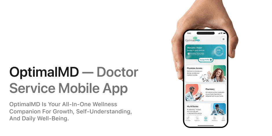
Automating what happens after someone submits that form only pays off if the form doesn't lose them first. The patient-facing platform behind OptimalMD's accessibility work treats the phone layout as the primary design, not the fallback.
Building mobile second and fixing it later costs more than starting there. A practice weighing a redesign is better off treating the phone screen as the actual product, with the desktop version built to keep up with it, rather than the other way around.
Cover photo by Towfiqu barbhuiya on Pexels
Sources
- Individuals' Access and Use of Patient Portals and Smartphone Health Apps, 2024 — HealthIT.gov (ONC)
- Mobile-first indexing best practices — Google Search Central