








Why Trust Is Central to Travel and Hospitality UX Design
Travel and hospitality UX design trust can decide whether visitors book a trip or leave for another site. People part with personal data and real money, having nothing more than a promise that their trip will be as described.
Every detail on your website or app sends a message: some say "you can trust us," but others create doubt instead.
With global online travel sales projected to exceed $830 billion in 2025, even minor improvements in trust-driven conversions produce significant business impact (Zeka Design). The numbers are real.
Building trust isn't limited to secure technology. It rests on honest communication, clear information, consistent visuals, and authentic storytelling. These details deter fraud. They calm visitor nerves instantly. Bookings happen when users feel secure.
Travel App UX Trust: The Specifics That Matter
For travel apps, trust starts with making the mobile experience easy from the outset. More than 60% of travel searches begin on smartphones now (Zeka Design). When an app confuses or hides prices until checkout, users often abandon bookings.
Simple flows, one-page checkouts, clear progress indicators, and visible security badges, help people feel confident from the first tap through to payment (SennaLabs). Confusion kills trust.
Features like real-time price comparison make decisions easier for hesitant customers by reducing uncertainty at the key moment of decision-making. For return visitors, personalized recommendations based on previous searches or bookings boost engagement and encourage repeat visits because everything feels tailored, not generic or automated.
Hospitality Website Design That Inspires Confidence
The hospitality website shapes a guest's first impression of your brand in just seconds. According to Zeka Design, using modern visuals with authentic imagery (not stock photos), strong consistent branding, and prominent social proof all send clear signals of credibility.
The best reviews are verified and show genuine guest photos for maximum persuasiveness. A GetYourGuide report found that 91% of 18–34-year-olds trust reviews as much as personal recommendations do for them.
Your design must work seamlessly on every device. Responsive layouts with clear information and fast load times demonstrate you respect each visitor's time. If something breaks or is slow on mobile, conversion rates drop immediately.
Accessibility also matters greatly. Sites supporting screen readers or offering high-contrast modes show respect for all customers.
The Booking Experience Trust Problem (and Solution)
A confusing booking process destroys user confidence right away. It's nearly impossible to recover if people lose faith at this stage. According to research cited by Zeka Design, 57% of travelers abandon bookings when surprise costs pop up late in the process.
Customers expect transparent pricing, including taxes and fees, right from the start because comparison shopping is so common now. Hiding costs does damage fast.
You can protect trust by breaking every step down clearly while displaying cancellation policies using straightforward language next to action buttons, not hidden away deep inside subpages or modal windows. Always accept familiar payment types with visible security signals; send personalized confirmation emails immediately after booking finishes.
These moves cut friction, the little moments of frustration where users second-guess their decision, and they reduce the odds someone will quit partway through their booking journey. Less friction means more sales.
Airbnb Trust Design: Lessons From the Biggest Name
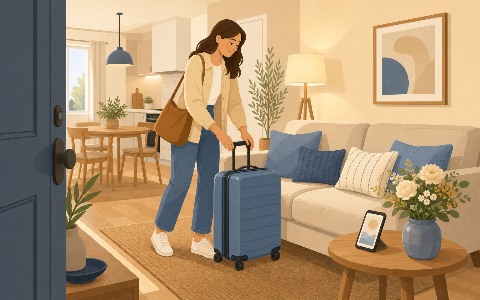
No brand has faced the challenge of building travel trust like Airbnb has over the last decade-plus.
To convince millions that booking stays with strangers was safe, Airbnb made two-way reviews mandatory for both guests and hosts, required verified profiles featuring real names plus photos, and layered in a multi-step reservation flow (University of Michigan C-SED).
Ratings come first; reviews get visual priority right alongside price; professional photography is favored so guests know what they'll actually get at arrival time.
This structure addresses specific concerns about safety or misrepresentation at every stage before checkout ever happens, not just looking polished but actively tackling core anxieties head-on for both sides of every transaction. Direct host–guest messaging provides reassurance; questions get answered personally instead of via cold automation only.
Academic work reveals something else: both how much information you present and how easy user interaction feels are critical for growing long-term trust in platforms like Airbnb (White Rose Research Online). These basics work together.
Travel Website Design Best Practices That Drive Bookings
The best travel websites combine high speed with maximum transparency, no trade-offs needed between fast load times and full disclosure of key information.
Menus should guide users according to their intent (like browsing destinations or picking rooms) instead of echoing your internal org chart (MONARQ G Hotels case study).
Present important facts, prices, maps, policies, itineraries, FAQs, so users can scan quickly; do not bury them deep inside PDFs or endless blocks of text nobody reads on mobile anyway.
Show authentic destination photos as hero images; these spark emotional connection while also proving authenticity (Zeka Design).
Keep colors, fonts, and copy voice consistent from landing page to checkout confirmation; unified branding across emails too builds recognition, and reliability breeds safety perception in anxious guests.
Poor performance damages user perception more than nearly any other flaw: if your site loads slowly or does not adapt well across devices big and small, trust erodes within seconds. People will not wait around for it to fix itself.
Trim every extra second from load times using compressed images and by streamlining site code wherever possible, even small improvements matter in highly competitive travel verticals where speed signals professionalism.
The Human Layer: Reviews, Identity & Policy Transparency
A newcomer visits your site with natural skepticism: Are offers genuine? Will someone help if plans go wrong? Can refunds actually be claimed without hassle?
Direct booking sites must prove themselves, a business address displayed up front instead of just an anonymous webform; recognizable payment options such as Stripe or PayPal at checkout (Frontiers in Public Health study).
Displaying verified reviews, pulled even from OTAs, creates reassurance at a glance when it matters most.
Do not let cancellation terms hide behind legalese either, spell out refund policies right on the booking page using plain English (“Free cancellation until X date”), not just tucked into fine print at payment screens or buried in links off-page somewhere nobody looks anyway.a0Your audience expects this clarity now after years seeing it elsewhere.
It's no longer a perk but an industry norm shaped by Airbnb's procedures and top hotel brand practices alike.a0Meet that expectation every time.a0
The Role of Trust Signals Across Cultures And Platforms
Cultural habits influence which factors earn user confidence around the world: some communities care most about visible hygiene certifications while others focus more on independent safety guarantees backed by outside organizations (Frontiers in Public Health study).
Community testimonials carry real weight, and robust dispute resolution channels become especially critical for hospitality exchange platforms where guests stay directly with hosts they do not know yet (National Cheng Kung University study on CouchSurfing). This applies everywhere these models operate.a0
The lesson is simple for any business: prioritize explicit promises around trust before layering in advanced narrative design elements or gamification features designed only to entertain after basic needs have been met fully.a0Trust comes first.a0It always does.a0