



















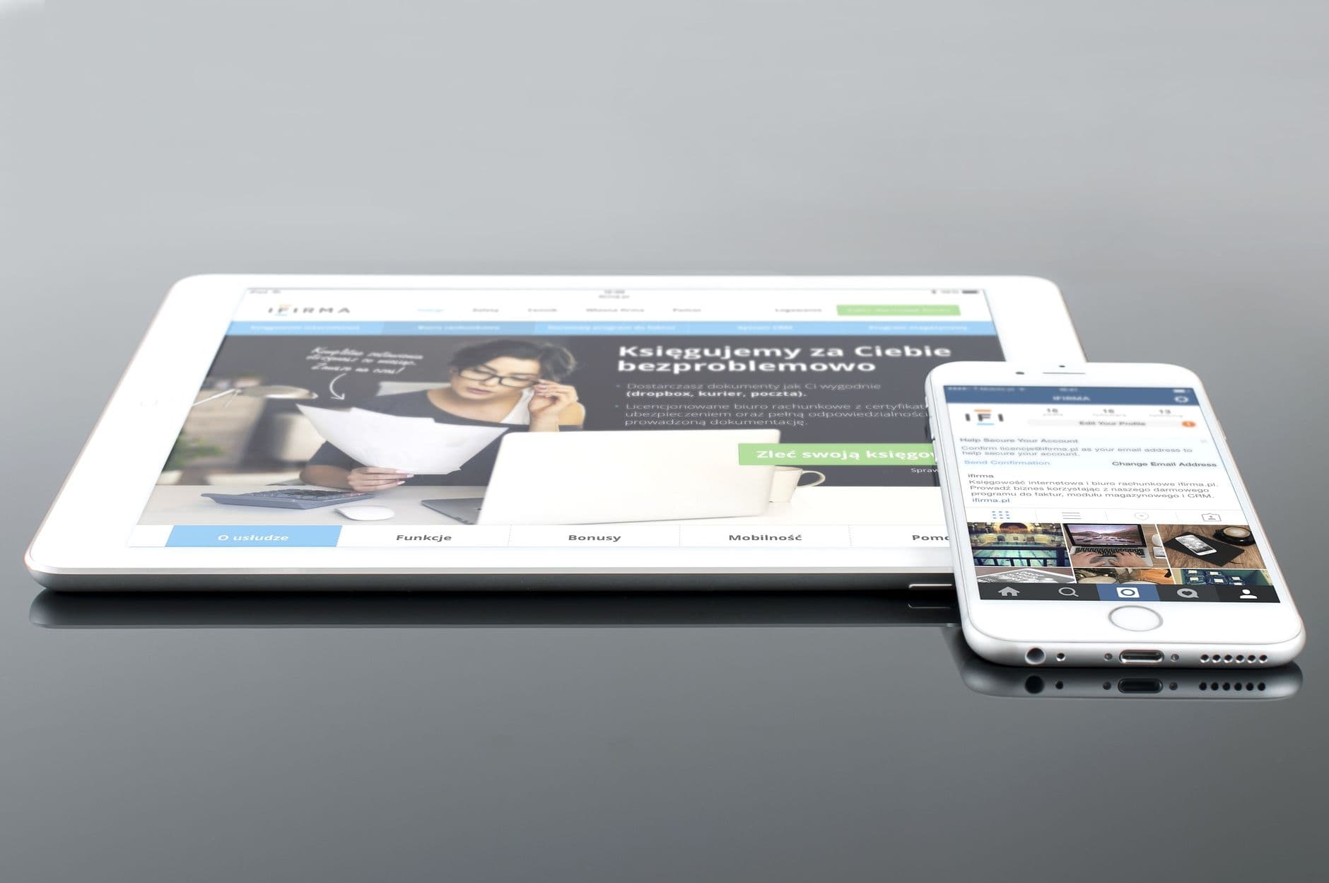
Most manufacturing websites are still built for a visitor sitting at a desktop, even though that visitor rarely shows up anymore.
In the second quarter of 2026, mobile devices made up 51.48% of global website traffic, according to StatCounter data reported by Statista.
The mobile-first web design manufacturing brands skip today is a bet against where a buyer actually is: on a phone, between meetings, or walking a production floor.
That shift changes more than screen size. A site built mobile-first treats the phone visitor as the default case, not a squeezed-down afterthought bolted onto a desktop layout after the fact.
Why Manufacturing Buyers Show Up on Mobile First
Industrial buyers don't do all their research from behind a desk.
Google's study with the Boston Consulting Group found that half of B2B search queries were already happening on smartphones by 2017, with mobile use climbing through the rest of the purchase path from there, according to Think with Google.
A procurement manager checking suppliers between plant walkthroughs isn't going to open a laptop to do it. An engineer on the shop floor pulling up a spec sheet is holding a phone, not sitting at a workstation.
If the site assumes otherwise, it loses that visit before the pitch even starts.
That same research tied the mobile experience directly to whether a buyer comes back. Buyers who rated a vendor's mobile experience as strong reported being more than 90% likely to purchase from that vendor again, against roughly half of buyers who rated the experience poorly.
What Mobile-First Web Design Manufacturing Sites Actually Need
The website is often the first real interaction a buyer has with a manufacturer, well before a sales call happens.
A Thomas industrial buyers survey found that 73% of B2B buyers pay attention to a supplier's website when deciding whether to submit an RFI, reported by Thomasnet. Slow or cramped pages lose that inquiry before a human ever sees it.
A mobile-first rebuild usually touches the same handful of things:
- Navigation collapses to the categories a buyer actually searches for, not every product line stacked into one menu.
- Spec sheets and datasheets open or download cleanly on a phone screen, instead of rendering as a shrunk desktop PDF.
- Quote and contact forms ask for only what's needed to start a conversation, since a long form typed on a phone gets abandoned halfway through.
- Pages load fast on a cellular connection, not just on the office Wi-Fi the site was tested on.
None of that is exotic work. It's closer to redesigning the decisions a buyer makes on the page than to a visual refresh, which is why a mobile-first rebuild usually starts with the user flow rather than the color palette.
Where to Start the Rebuild
Photo by Strange Happenings on Pexels
Manufacturers that treat this as a full rebuild rather than a patch tend to get more out of it than the ones that add a mobile stylesheet to an existing desktop site and call it done.
The underlying structure, not just the styling, is what a phone visitor struggles with.
Budget is usually the real blocker, and it's worth planning for before the project starts rather than mid-build. What a realistic manufacturing marketing budget covers is a reasonable place to check that against.
Pair the rebuild with how the site gets found in the first place, since a mobile-first page nobody reaches doesn't move the RFI number either.
The buyer already made the switch to mobile. Either the site meets them there, or it loses the inquiry to a competitor whose site did.
Sources
- Mobile web traffic share worldwide — Statista
- How mobile is reshaping the B2B marketing landscape — Think with Google