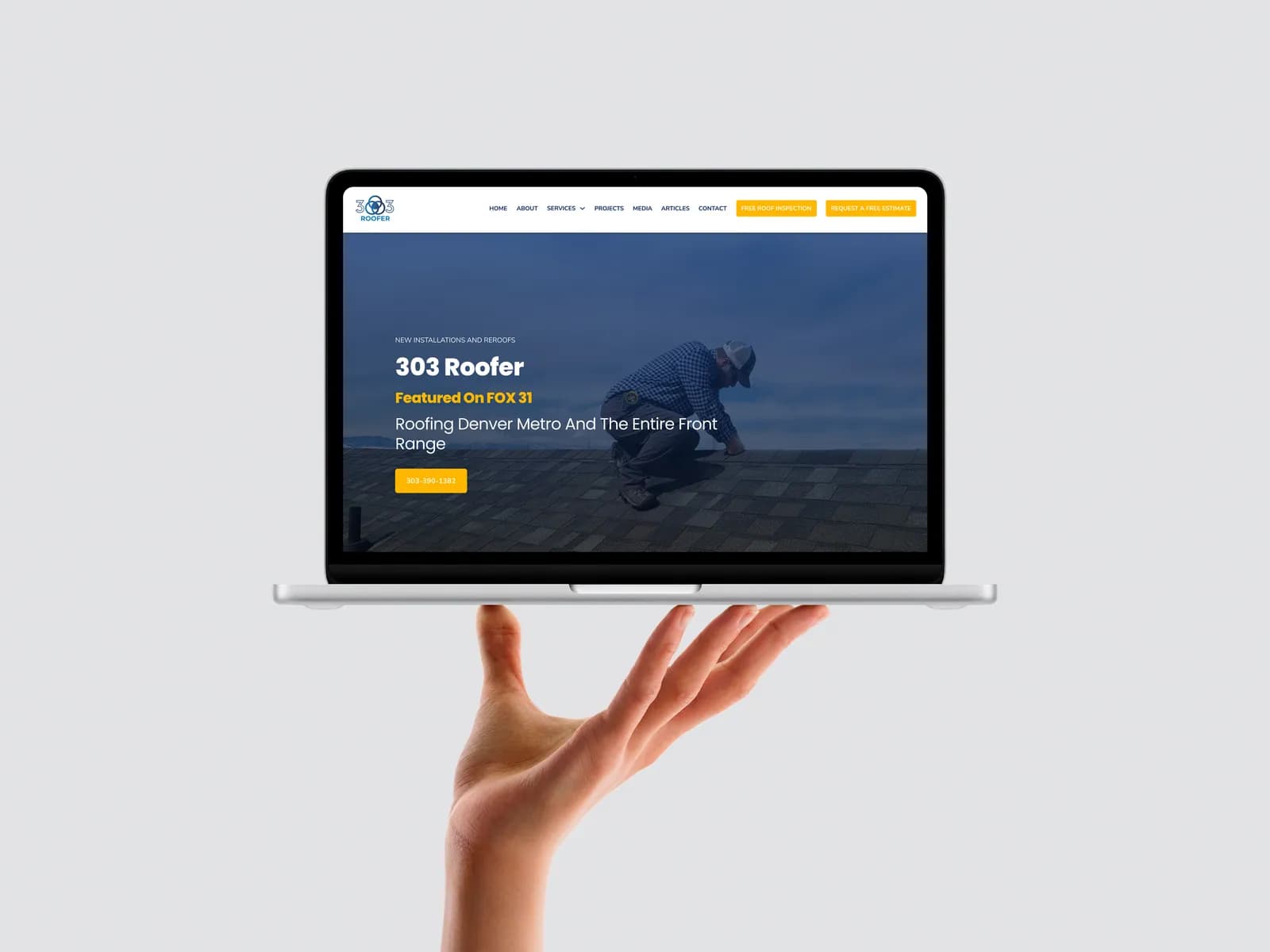
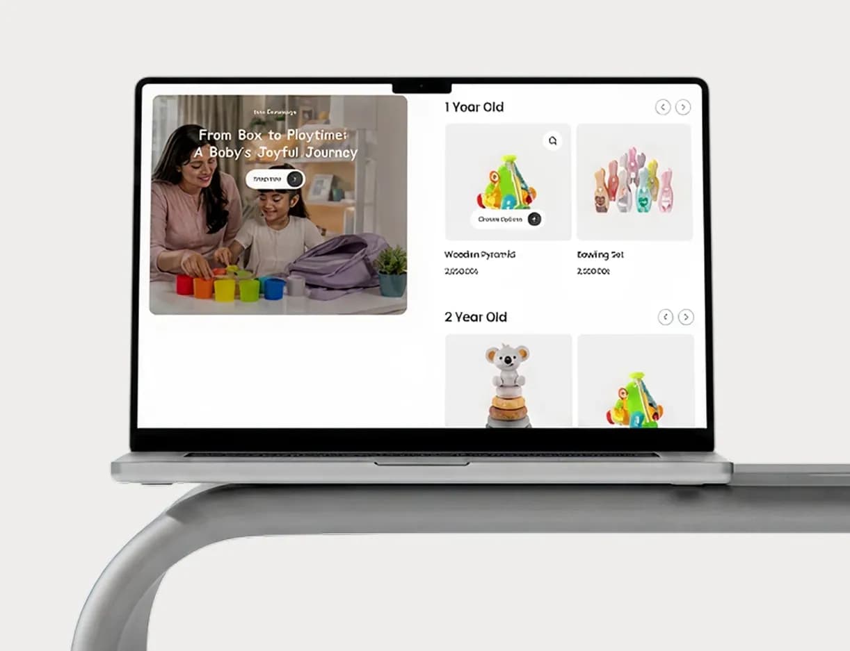













A shipper vetting a new carrier decides whether to pick up the phone in about the time it takes to scroll one screen. If your site loads slowly, buries the quote form, or looks untouched since the last decade, that decision is already made.
These are the logistics UX mistakes that quietly cost freight and supply chain companies leads before a prospect ever reaches out, and most of them are fixable without a full rebuild.
The Logistics UX Mistakes Hiding in Plain Sight
Shippers screen carriers online before they ever call. FreightWaves reports that direct shippers won't call a carrier without a credible website, and that a missing site is treated as a red flag rather than a neutral gap.
Fraud is part of why. Shippers deal with fake MC numbers, double brokering and paperwork that doesn't match the DOT record often enough that a professional site becomes a trust check, not just marketing.
- A logo that looks maintained, not a stretched screenshot
- A clear, specific service area rather than "nationwide coverage"
- A real company story: how long you've operated, what you haul
- Contact details that actually work, including a phone someone answers
Most small carriers skip at least one of these, which is exactly why a site built around what shippers are actually checking for stands out.
AI carrier-screening tools are starting to filter on this same information, so a thin site now costs you at both the human and the algorithmic gate. A logistics site built on faster infrastructure tends to carry these signals better than one bolted onto a generic builder.
Your Quote Form Is Turning Interested Buyers Away
Baymard Institute's research across its checkout benchmark of major e-commerce sites found the average checkout asks for 11.3 form fields when roughly 8 would do, and that 17% of users abandon over the complexity alone.
A freight quote form runs on the same logic. Every field beyond what a lane, weight and timeline actually require is a chance for a dispatcher to close the tab and try a competitor instead.
Baymard also found that most sites still force account creation before letting a user finish, rather than delaying it until after the request is in.
A quote request is not a purchase. Treating it like a full checkout, with the same field count and the same account wall, is why so many of these forms get abandoned half-filled. Rebuilding that flow is exactly the kind of work a proper e-commerce and forms rebuild is meant to fix.
Slow Pages Cost You Before Anyone Reads a Word

Photo by StartupStockPhotos on Pixabay
Speed decides a lot of this before design even gets a chance. Marketing Dive reported on Google's own mobile speed research showing that 53% of mobile visitors abandon a site that takes longer than three seconds to load.
The same research found that sites loading within five seconds saw 70% longer sessions and 35% lower bounce rates compared with pages stuck around nineteen seconds.
A dispatcher checking your site from a phone between calls isn't going to wait around for it to catch up.
None of this requires a new brand or a bigger budget. It requires a site that loads fast, asks for less, and proves who you are in the first few seconds. Getting found in the first place matters just as much, which is where what actually moved the needle in one logistics local SEO case study is worth a look before you assume the fix is purely visual.
Cover photo by Tiger Lily on Pexels
Sources
- Checkout Optimization: Minimize Form Fields — Baymard Institute
- Why Every Small Carrier Needs a Web Presence — Especially If You Want Direct Freight — FreightWaves