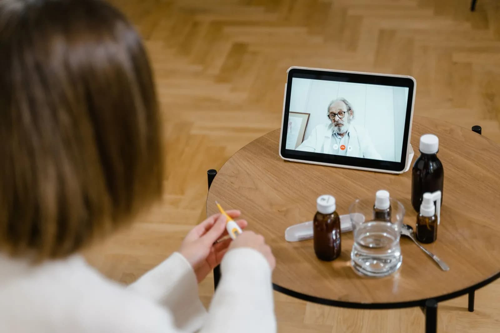















Patients open health apps at awkward moments: after a worrying result, on a small phone in a waiting room, or on an older device with a weak connection. Healthcare UX design has to be built around those moments, and most portals aren't. They're built around the clinic.
What follows is the practical version, drawn from US government guidance on health websites, a federally funded portal study and the accessibility rules that now apply to organisations receiving HHS funding.
Healthcare UX design starts with the patient's task, not the portal's menu
A federally funded project led by Jessica Ancker at Weill Cornell Medicine, summarised by the Agency for Healthcare Research and Quality, names poor usability and portal designs that serve organisational goals rather than patients' goals as common barriers to adoption. When the team ran a usability evaluation with patients and caregivers, patients often had no clear sense of what tasks managing their own health information involved.
That finding explains a lot of bad navigation. A menu organised by department or by internal system mirrors how the practice works, and a patient who came to book a follow-up has to translate.
The same project added context-specific links to plain-language education materials in a portal at a federally qualified health center. About 10 percent of patients used them. It's one site, so treat it as a caution rather than a benchmark: helpful content that sits behind an extra click goes unread.
So begin with the five or six things patients actually come to do, and name each screen after the task. Our guide to customer journey mapping for dental practices shows how to list those tasks in order, and the method carries over to any clinic.
Write for readers with limited health literacy
Lead with the most important information, use plain language and give specific action steps. That is the core of the Health Literacy Online checklist, published by the US Office of Disease Prevention and Health Promotion, and strong healthcare UX design applies it to app copy as much as to web pages.
The same checklist also covers how the screen looks. Its display advice reduces to a short set of rules:
Keep paragraphs short and use bullets and short lists.
Write headings that describe the content beneath them.
Set text at 16 pixels or larger and leave generous white space.
Keep the most important content above the fold, on mobile too.
Mark links with colour or an underline.
Keep the tone positive and say what the patient gains by acting. An appointment reminder that explains what to bring and how long the visit takes gets more done than one that only states a time.
Notice what's absent from that list: clinical vocabulary. If a screen needs a glossary, rewrite the screen.
Keep navigation shallow and linear
Navigation is where healthcare UX design pays off fastest: keep the home screen simple, with limited text and few elements, and give people more than one way to find things. Health Literacy Online's at-a-glance summary also asks for a simple search function with clearly displayed results, and for easy ways back to the home page and menus.
The checklist adds a few details that apps routinely skip. Information paths should be linear. Button labels should be meaningful, so "Request a refill" rather than "Submit". Clickable elements should look clickable, and the browser's Back button should work, which in a web-based portal is a common casualty of single-page builds.
Forms deserve their own attention, because they're where a task either finishes or doesn't. Health Literacy Online asks for user-friendly forms but gives no detailed spec, so the practical answer is to test each form with real patients, as the testing section below describes.
Our piece on dental practice mobile app UX applies these rules to one specialty and is a useful template for the booking and reminder flows every clinic needs.
Design for accessibility before the HHS deadline
If your organisation receives HHS funding, your web content and mobile apps must meet WCAG 2.1 Level AA. On May 7, 2026, HHS's Office for Civil Rights published an interim final rule that moved the compliance dates back by one year, according to a Duane Morris alert. The technical standard didn't change, only the timing.
Recipient size | Original date | Current date |
|---|---|---|
15 or more employees | May 11, 2026 | May 11, 2027 |
Fewer than 15 employees | May 10, 2027 | May 10, 2028 |
Coverage is broad: the alert lists hospitals, community health centers, nursing homes that take Medicare or Medicaid, and state Medicaid agencies among those that receive HHS funding in some form.
Colour contrast is the easiest place to start. The W3C's contrast minimum criterion requires a ratio of at least 4.5:1 for normal text and 3:1 for large text at Level AA, so that people with moderately low vision can read without assistive technology. Pale grey captions on white are the usual failure, and a design system fixes them once rather than screen by screen.
Accessibility belongs inside healthcare UX design from the first sketch. A late deadline is a reason to build accessibility in now, not to wait. Retrofitting a finished app means reopening every screen, which is slower than drawing the screens correctly the first time.
Test with the patients who struggle most

Photo by Fabian Wiktor on Pexels
Recruit people with limited literacy and limited health literacy, not only colleagues and friendly regulars. Health Literacy Online's checklist asks for plain-language test materials, moderators experienced with these users and several ways of confirming that participants understood their tasks, such as reading directions aloud and providing them in writing.
Testing turns healthcare UX design from opinion into evidence. Test on mobile, and on conditions worse than your office Wi-Fi. The guidance recommends designing pages that work on older devices, slow connections and limited data plans, which matters if your patients are the ones least likely to own a recent phone.
The question to put to each participant is whether they understood the screen and whether they could act on it. A patient who can read a lab result but doesn't know what to do next has been shown information, not helped.
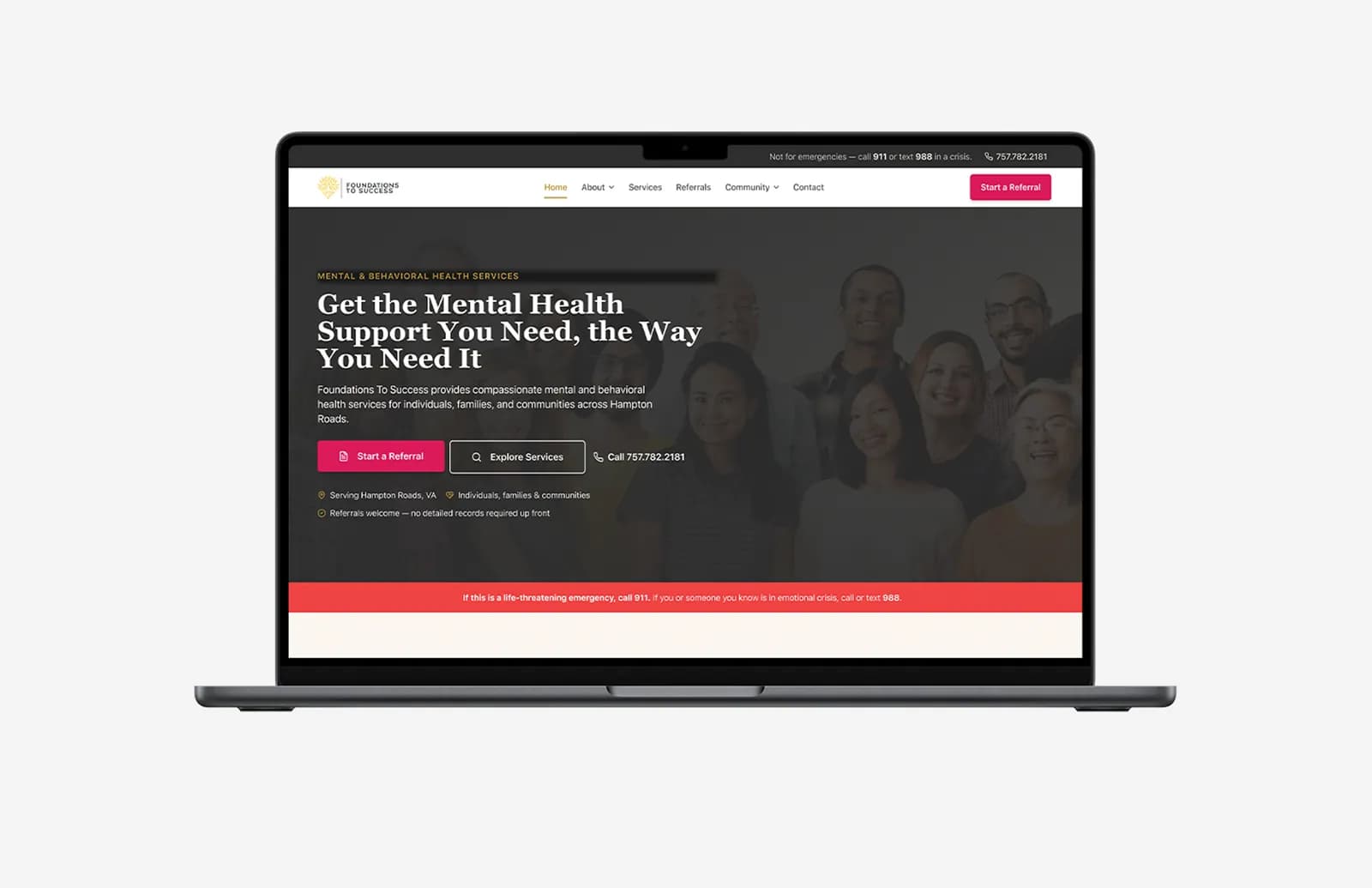
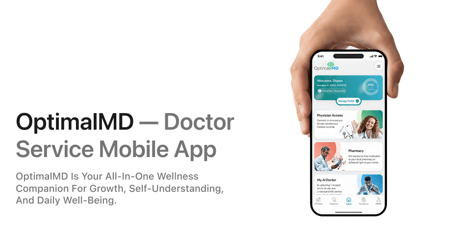
When we built OptimalMD's digital product, we designed and delivered the website, the members portal and the mobile app end to end, from design through development to launch. Having one team across all three surfaces is what lets a booking flow feel the same on each.
If you're planning a build and want design handled with this level of rigour, our UI/UX service starts with the research above.
Budget for the design work as well as the code
Healthcare UX design needs its own line in the budget. Research sessions, accessibility checks and a round of revisions after patient testing all take time, and they're easy to cut when a project runs tight. The cost shows up later as support calls and rework, which is why they belong in the first estimate. Our healthcare software development cost guide covers where the money goes on the build side.
For portal-specific scope, what patient portal development actually takes is the better next read. Whatever you build, schedule the first round of patient testing before any screen is final, while changing it is still cheap.
Frequently asked questions
Which organisations does the HHS accessibility rule cover?
Any organisation that receives HHS funding in some form, such as grants, loans or cooperative agreements. Duane Morris lists hospitals, community health centers, Medicare- and Medicaid-participating nursing homes and state Medicaid agencies as examples.
Did the May 2026 extension change the accessibility standard?
No. The interim final rule moved the dates by one year and left the requirement at WCAG 2.1 Level AA.
Why test a patient app on older phones and slow connections?
Because some patients use older devices, slow connections and limited data plans, and the Health Literacy Online guidance asks designers to make pages work for them. An app tested only on a new phone over office Wi-Fi hasn't been tested on those patients.
Cover photo by RDNE Stock project on Pexels
Sources
Checklist - Health Literacy Online — Office of Disease Prevention and Health Promotion
Health Literacy Online at a Glance — Office of Disease Prevention and Health Promotion