








A quarter of a home service business's potential customers already struggle with sites that weren't built for them. The CDC's 2022 national health survey found that 28.7% of US adults report a disability of some kind. That share rises sharply with age.
For a plumber, an electrician or an HVAC company, accessible UI design for home service businesses isn't a compliance checkbox. It's the difference between a booked job and a closed tab.
Most people calling for a repair aren't twenty-five-year-olds testing a prototype. They're homeowners standing over a leaking pipe with a phone in one hand.
What Accessible UI Design for Home Service Businesses Actually Requires
Adults 65 and older report disability at 43.9%, roughly double the overall rate, according to the same CDC data. That's precisely the age group most likely to own a home and need a contractor on short notice.
They're also the least connected group online. Pew Research Center found in a survey fielded through June 2025 that 78% of adults 65 and older own a smartphone, a noticeably lower rate than younger adults.
When someone in that bracket does open your site, they're often doing it on an older device, with less patience for a form that doesn't work.
Add in the customer dealing with a burst pipe at 11pm, on a phone, in bad light, with one hand free. The same fixes that help someone with low vision or limited dexterity help them too.
The Accessibility Mistakes Almost Every Site Makes
The 2026 WebAIM Million report scanned the home pages of a million websites and found that 95.9% had at least one detected WCAG failure. Those same six failure types have topped the list for seven years running.
| Failure | Share of homepages | What it breaks on a home service site |
|---|---|---|
| Low contrast text | 83.9% | Prices and phone numbers become unreadable in sunlight or for low vision |
| Missing form labels | 51% | A screen reader can't tell a caller which field they're filling in on a quote form |
| Missing alt text | 53.1% | Photos of finished jobs, a core trust signal, carry no information for blind visitors |
| Empty links or buttons | 46.3% / 30.6% | A \"Call Now\" button with no accessible name does nothing for assistive tech |
A home service site leans on exactly the elements that list targets: a quote form, a gallery of past jobs, and a phone number that needs to be tappable, not just readable.
Fixing Booking Forms, Buttons and Contact Calls
The W3C's WCAG 2.2 standard set a specific rule for this: pointer targets need to be at least 24 by 24 CSS pixels, with narrow exceptions for inline links and closely spaced controls.
Common practice goes further, recommending something closer to a fingertip's width for anything a visitor needs to hit without looking twice.
Getting that right is less a design trend than a fundamental our UI/UX work is built around: readable contrast, labeled fields, and controls sized for a thumb rather than a mouse pointer.
Whether that quote form lives on an existing site or gets rebuilt as part of a larger web build, the checklist doesn't change.
It's the same thinking behind the accessible healthcare platform we built for OptimalMD, where readable, well-labeled interfaces were part of the brief from day one.
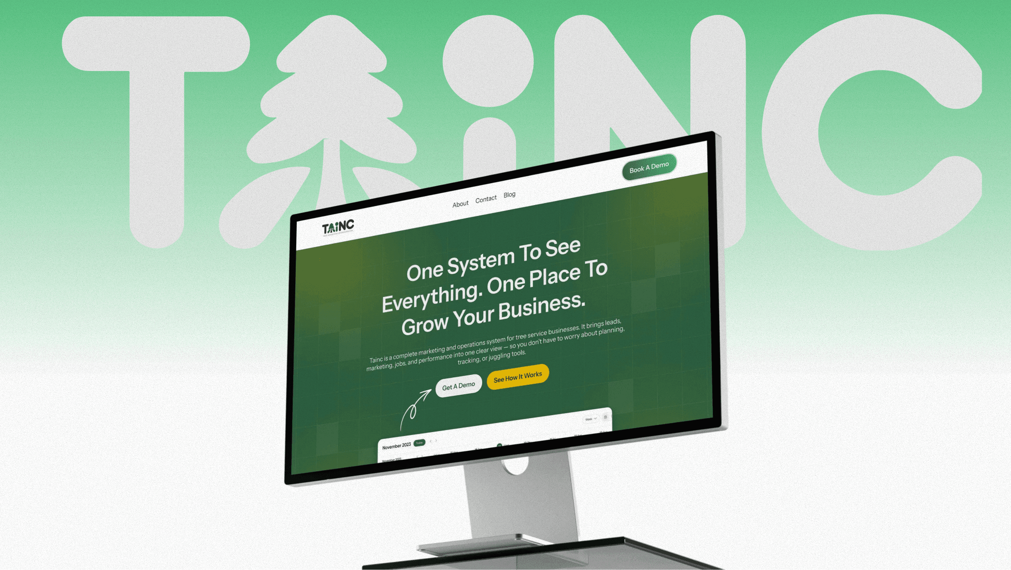
The same fundamentals apply to lead capture for any home service business, including the growth platform we built for tree service companies, where a clear, accessible quote form is what turns a visitor into a booked job.
None of this needs a redesign from scratch. Start with the form a customer fills out to request a quote. Label every field, size the submit button to hit by feel, and check the contrast against direct sunlight, not just a monitor. That's where the missed calls are actually happening.
Sources
- Disability and Health Data Now — CDC
- The WebAIM Million 2026 — WebAIM