








Dental Practice Wireframing Basics: Why Structure Matters
Most patients searching for a new dentist decide within 90 seconds whether to stay on your website, make a call, or leave; this snap judgment relies less on visual effects or colours and more on the wireframe, the site layout, navigation, and clear calls-to-action presented right from the start.
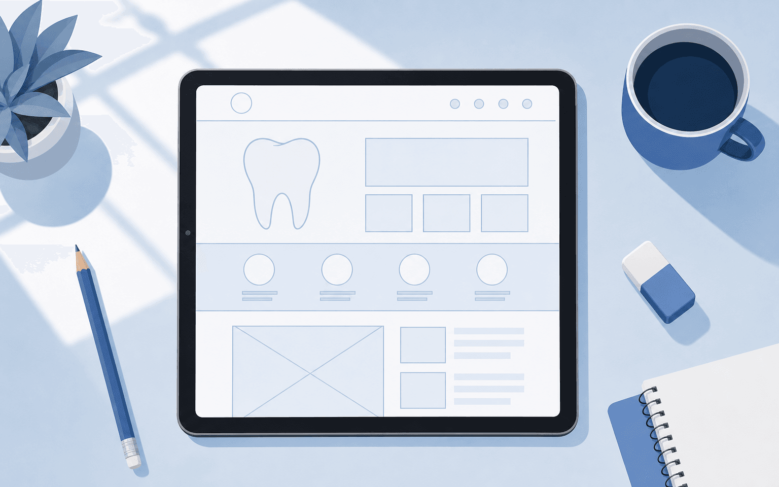
Wireframing maps out your dental website's foundation before any designer adds polish. When done well, it guides every critical patient action, like finding directions, booking appointments, or browsing services, with minimal effort. In practice, the patient journey gets shaped from their perspective, not just by arranging content blocks.
How to Plan a Dental Practice Website Wireframe
The most effective dental practice websites put patients' priorities ahead of aesthetics. When patients arrive at your website, they often feel urgent or anxious. They need three answers instantly: what does this clinic offer? Where is it? Can I book right now?
Build your wireframe in this order: start with a hero section that tells visitors exactly what type of dental practice you run and where you're located. Feature both a tap-to-call number and an online booking button; both must be visible without scrolling. Over 60% of dental site visits come from mobile devices now. Immediate access matters more than ever.
Simplify navigation to six or seven menu items at most. Give each treatment its own dedicated page instead of grouping them into one long list, this helps both search engines and potential patients quickly find specific offerings like implants or emergency care.
Include space for team photos that show real staff members, not stock models. Place reviews above the fold so users see proof immediately. Provide service buttons that let users jump directly to core treatments.
Dental Practice UX Wireframing Basics: What Every User Flow Needs
A comfortable user experience starts by reducing patient anxiety, which drives more behaviour than curiosity in dentistry. Give users quick ways to check costs. Show appointment availability easily too. Confirm accepted insurance, and provide options for after-hours contact when possible.
A strong wireframe keeps the booking button visible on mobile as a sticky footer bar so it's always handy; tappable phone numbers should appear across every section as well since making these clickable has been shown in audits to boost call rates by up to 40%.
Don't demand too much up front; only ask for name, phone number, and preferred slot on first contact forms because every extra field sharply drops conversion rates.
Testimonials should appear early and be specific, for example, “gentle care during my root canal” carries more weight than “great dentist.”
Reducing anxiety isn't just about copy; it also relies on clear structure. Use soothing colours like teal or navy blue instead of stark reds where possible. Leave white space around key actions and core content blocks so pages don't look crowded, clutter can overwhelm someone already deciding under stress.
Dentist Website UI Wireframe Checklist
Each dental website should reflect its own audience and services but high-performing clinics consistently use certain elements in their UI wireframes:
Above-the-fold clarity: The top of every homepage should have the clinic's name or specialty, location (city or neighbourhood), and a value statement such as “Gentle family care in [city].” Visitors expect this immediately.
Tappable phone number: Place it in visible areas like headers or footers so patients can call directly at any point.
Online booking button: The button should stand out with a contrasting colour and stay in the same spot on all pages.
Main service grid: Icons or cards link straight to key treatments, so instead of burying Invisalign or emergency visits inside drop-downs, highlight them upfront for easy scanning.
Reviews block: Show real reviews (with star ratings and platform logos) no lower than two scrolls from the top so they aren't missed by skimmers.
Pediatric/cosmetic differentiation: Use images and language tailored for those groups, for instance, family group portraits for children's dentistry versus beauty-style photography for cosmetics.
Insurance/financing badge: Display badges near the top if offering insurance or payment plans; price-sensitive visitors often leave if they don't spot this reassurance right away.
Meet the team summary: Add short bios and professional photos early on since trust builds before credentials are even read in detail.
Dental Website Layout Wireframe Templates: What Works Best?
No one template fits all clinics exactly but successful dental website layouts tend to follow similar flows. Start with a hero area then move through a treatment/service grid where each icon links to its own page.
Next comes a concise testimonials carousel featuring four to six carefully chosen reviews, handpicked ones work best here for impact.
Then provide introductions for your team with photos afterward followed by an after-hours/emergency banner if relevant; wrap up with an FAQ accordion answering real concerns about pain management or payment options.
Treatment pages work best when they use simple wireframes built around common questions. Open with a clear H1 like “Invisalign Braces in [City].” Answer directly if someone is suitable; describe what happens step-by-step through each appointment stage so expectations are set early on.
Highlight practical benefits (“Eat comfortably again”). Display approximate costs when possible (“from £X”). Include before-and-after images if relevant, and always loop back to calls-to-action such as booking options nearby.
This approach supports local SEO because giving each treatment its own keyword-focused URL attracts more targeted searches while internal links from blog posts or FAQs help spread authority throughout the site itself.
Patients scanning your website want credentials up front. Push testimonials and photos high instead of tucking them at the bottom of dense clinical text blocks where they can be missed.
Dental Website Design Tips That Drive Patient Action
The main difference between successful practices usually isn't technical skill but how effectively their websites convert visits into bookings over time.
If you want to drive real action: use genuine photography of staff rather than generic stock images; prefer calm over bold colours; minimise form fields wherever possible; reveal insurance/payment details early (not just inside long FAQs); keep messages clear across all channels by repeating colours, logos, CTA phrasing everywhere, consistency reassures even repeat visitors who switch devices during research sessions.
Pediatric sites benefit from lighter palettes plus playful icons if families are your target market. Cosmetic clinics use professional portraits shot like editorial beauty campaigns, that signals premium outcomes instantly without stating it outright anywhere in text.
Tying It Together: Building Trust from First Click to Booked Visit
You build trust not just by making your website look good but also by removing roadblocks that stop anxious people from acting quickly, or drive them away altogether without ever getting in touch at all.
Effective sites state clearly who they serve (“Cosmetic Dentist in [location]”) and outline exact next steps (“Book Online Now”). Surface reviews near moments where visitors decide what action to take, not buried deep inside internal pages, and maintain layouts that stay responsive regardless of device size used by each person browsing your site today.
If you are preparing for a new launch or planning an overhaul, from rough homepage diagrams through detailed UX flowcharts.
It pays off when structure takes priority over decoration at every stage because structure first creates a digital home that welcomes people much like your physical clinic does, and books more appointments because of it.a0Structure first creates a digital home that welcomes people much like your physical clinic does, and books more appointments because of it.
Sources
Web Design Concepts For Your Dental Practice: What To Know — mediboost.com.au
Custom Dental Website Case Study | Scrum Digital — scrumdigital.com